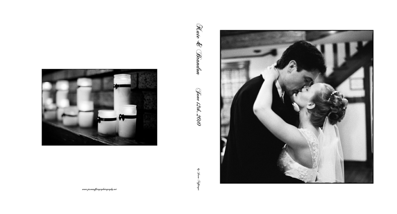
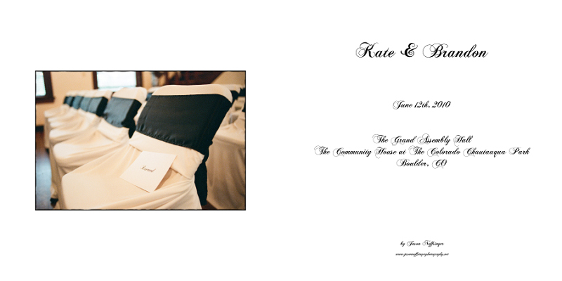
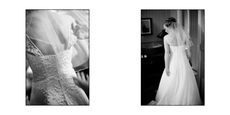
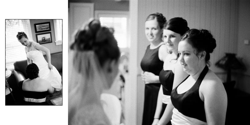
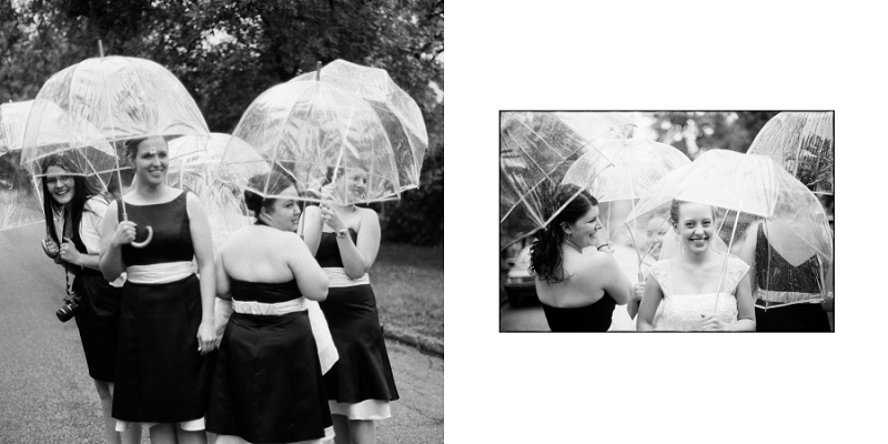
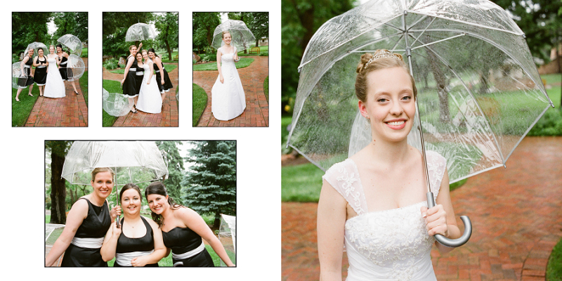
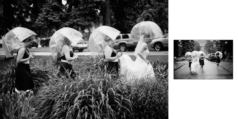
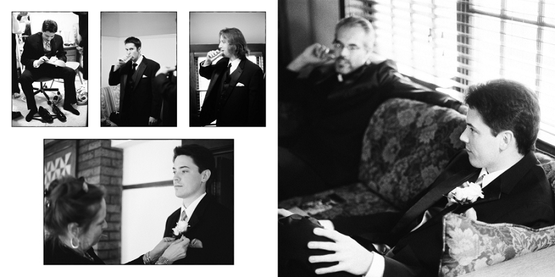
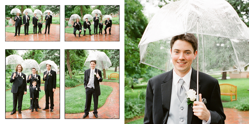
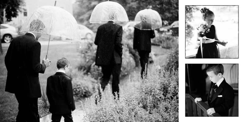
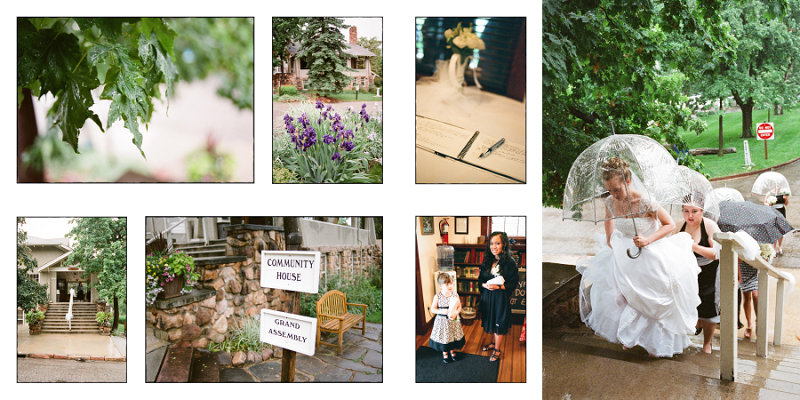
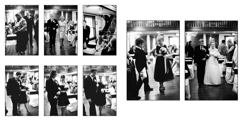
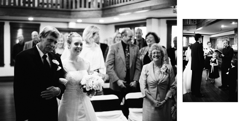
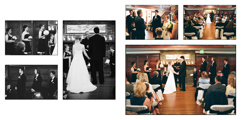
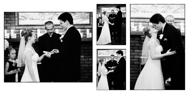
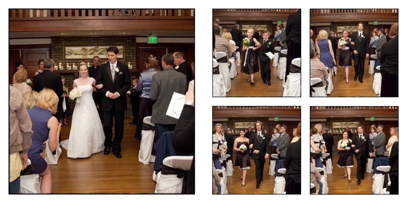
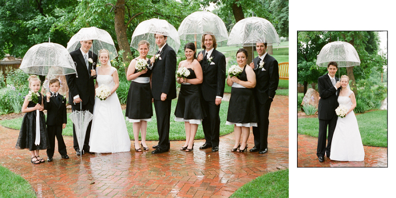
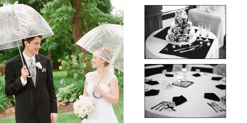
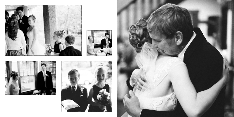
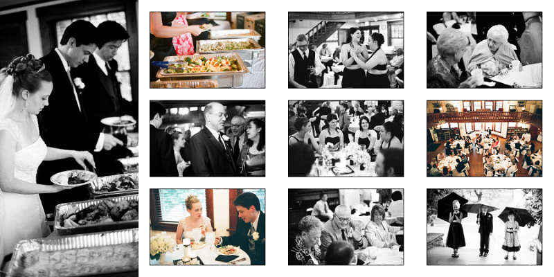
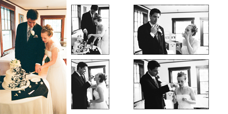
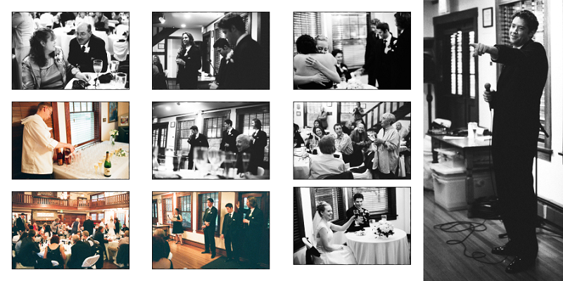
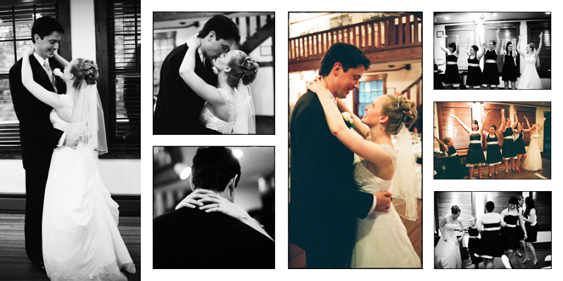
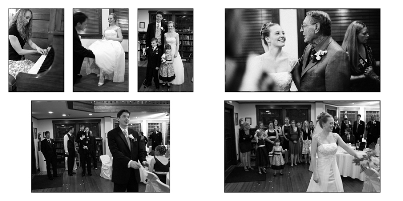
It’s been a while since I put up a wedding photography post, so I thought I would give you a look at the album I designed to document Kate and Brandon’s beautiful wedding at the Chautauqua Community House in Boulder, CO.
As I was shooting the wedding on that rainy June day, there were a lot of images that I made specifically with this album in mind. It’s really gratifying to see so many of them make the final cut. Kate is a very artistic person, so I had her and Brandon make the final selection of images to include in the album. I don’t always work in this way, but in this case, I think it worked out really well.
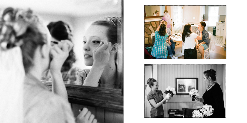
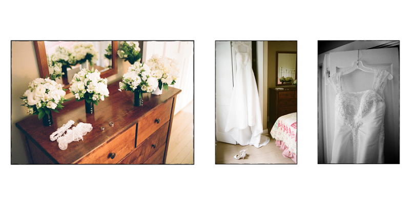
The book contains about 110 images spread out over 50 pages and is laid out in chronological order from getting ready all the way through the reception. I find placing the images in context really helps people understand how the day unfolded, and also helps the bride and groom mentally “fill in the gaps” between the images.
I designed the book as a 12X12, but also made it available in 10X10, 8X8, and 6X6 for family and friends to purchase. The pages of the album are printed on real photo paper and the spreads lay flat with no seam in the middle. The font used for the text is the same font that Kate chose for her wedding invitations, so this helps tie the album to the other mementos from the wedding day.
As you can see, I used very little text, a simple layout, and only one design element – a very subtle sloppy border around all of the floating images. I think these pictures speak for themselves, and adding a complicated layout, or a bunch of extra elements would really detract from the story of the day. This tends to be my album design philosophy – let the pictures stand on their own.
Tech Info:
This whole book was laid out using Layered Photoshop Files
The sloppy borders were created using a Photoshop action
All but 11 images in the book were shot on film
